Back
Hotel Nudibranch
Author: Amazing Architecture Architecture firm: SpActrum Location: Dashaao, Dongping, Dongtou District, Wenzhou, Zhejiang Province, P.R.China Tools used: SpActrum Principal architect: Yan Pan Design team: Zhen Li, Yu Zheng, Hao Chen, ShAil Paragkum Patel, Nan Sun, and Yuchen Qiu Collaborators: Visualization: SpActrum Built area: 31000 m² Site area: Design year: 2019 Completion year: Budget: Client: Pingyang (Nanji Island) Tourism Investment Co. Status: Concept - Design Typology: Hospitality › Hotel, Urban Facility, Playground, Restaurants, Bars, Spa and swimming pool
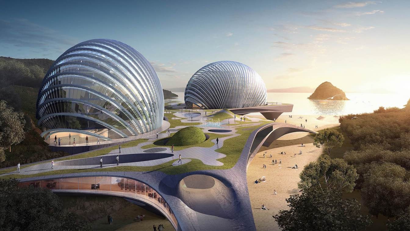
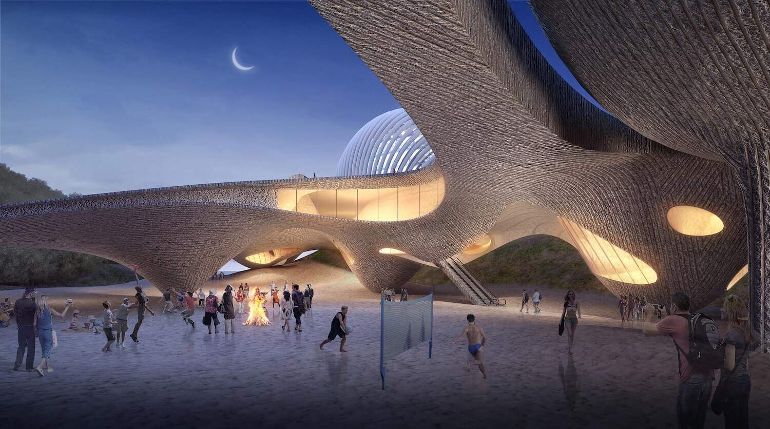
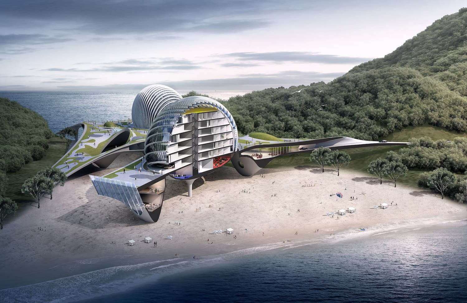
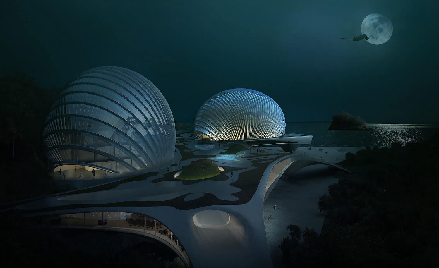
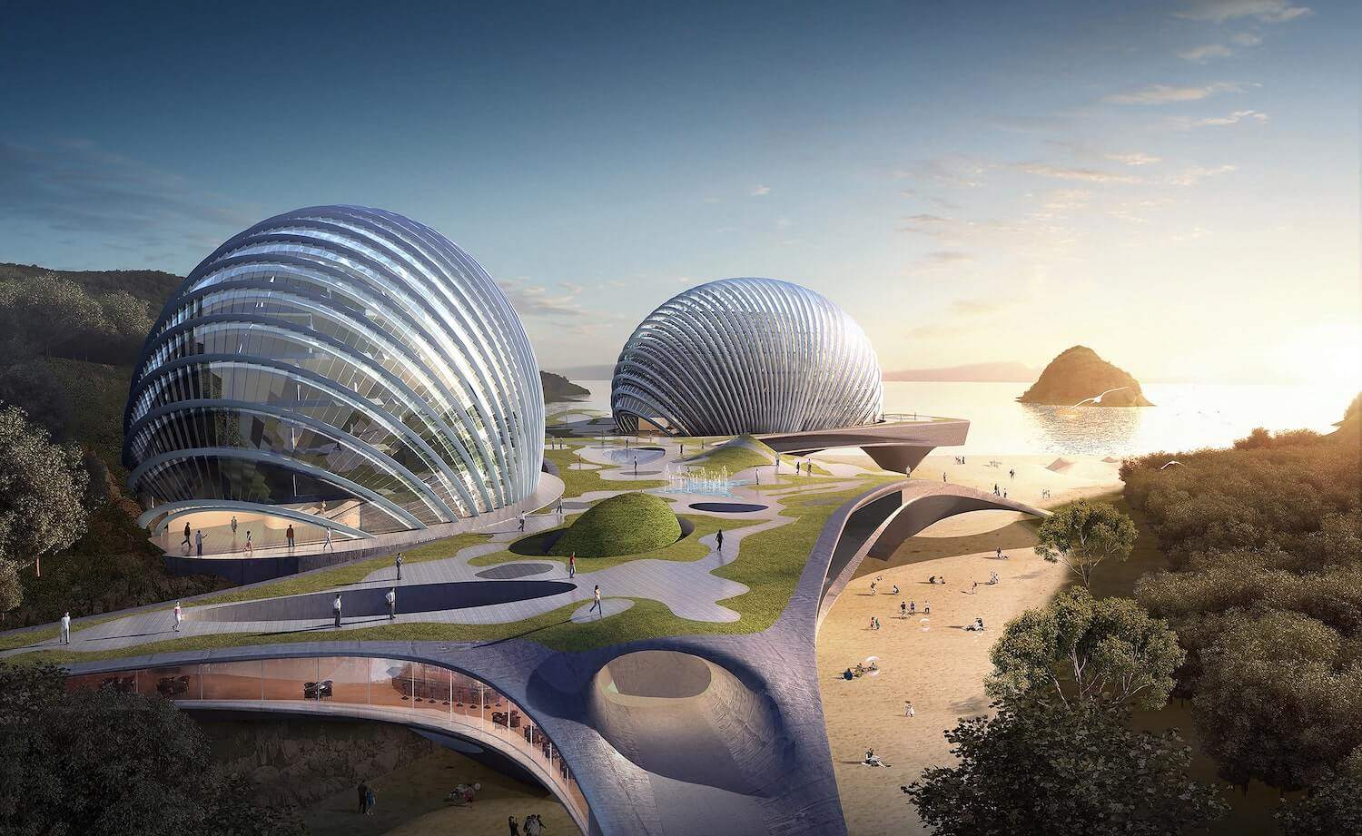
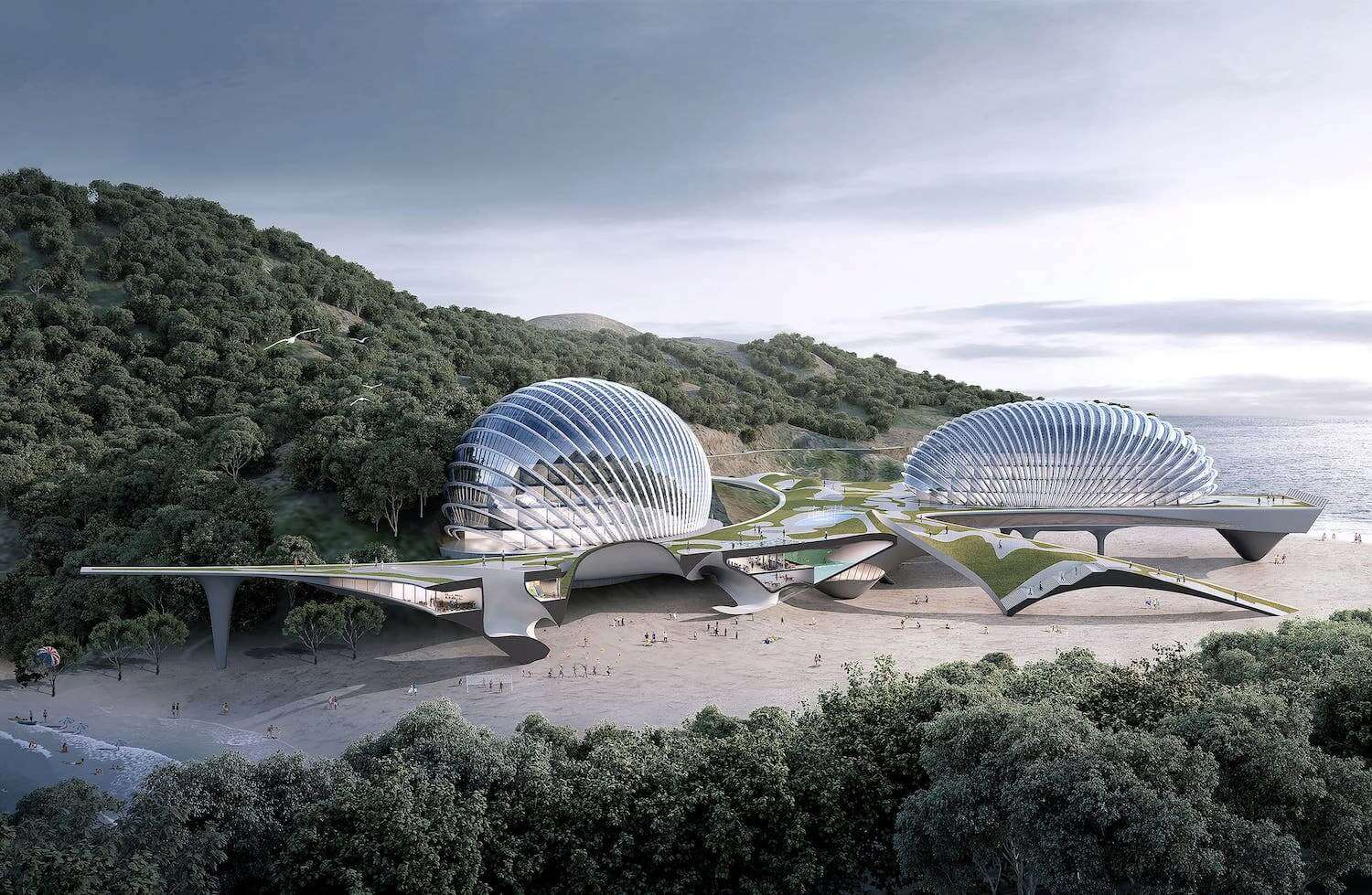
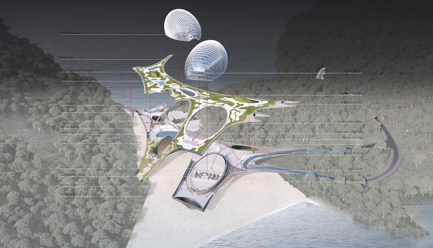
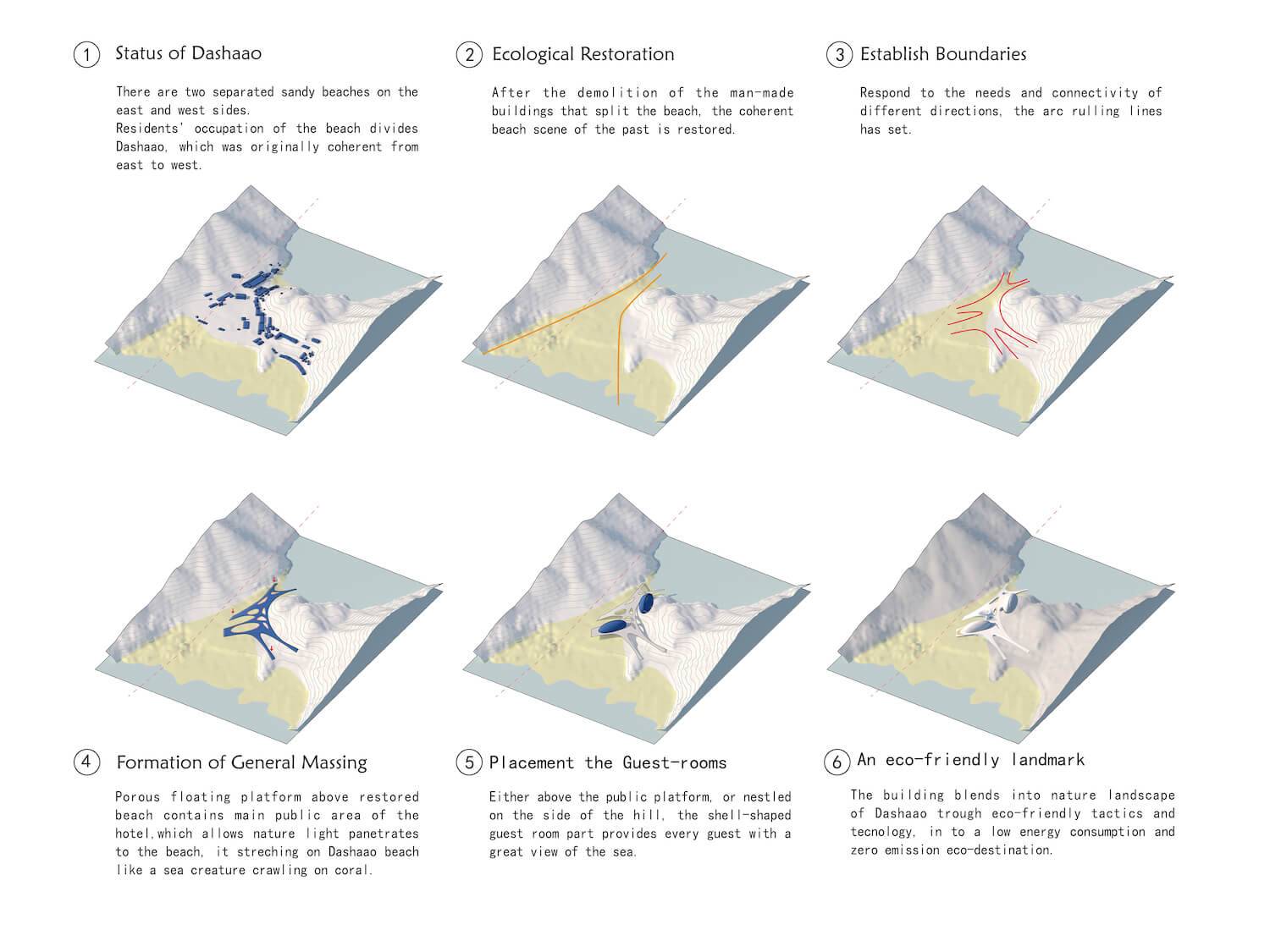
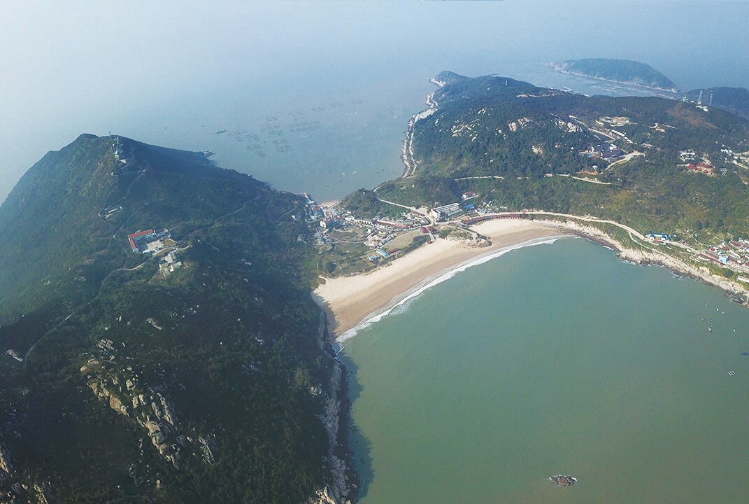
SpActrum: The Hotel Nudibranch is a key part of the Nanji international tourism island development in Zhejiang, in the East China Sea. The site is called Dashaao, which means ‘grand sandy bay’. The design is inspired by sea creatures, which the island is famous for, such as nudibranch and other shellfish. This “mollusk” lifts itself by its soft legs and stretches its tentacles to explore different directions. The public part of the hotel resembles a floating space above the sand. The sandy ground blends into the hotel to become an outdoor playground in the shadow cast by the building above. The legs connect people from the ground to restaurants and bars, and the SPA and swimming pool to the public space above. There is a private garden above the public floor, dedicated to residents of the hotel. The hotel rooms are located in two shell-like buildings that provide most of the rooms with beautiful sea views. The building blends the boundaries between the building and the landscape by its organic form and flexible connectivity; it sits on the site like a nudibranch crouching on the peaceful bay. A lot of Eco-friendly technologies have been installed to minimize the environment impact on the site.
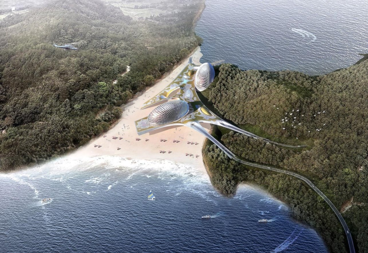
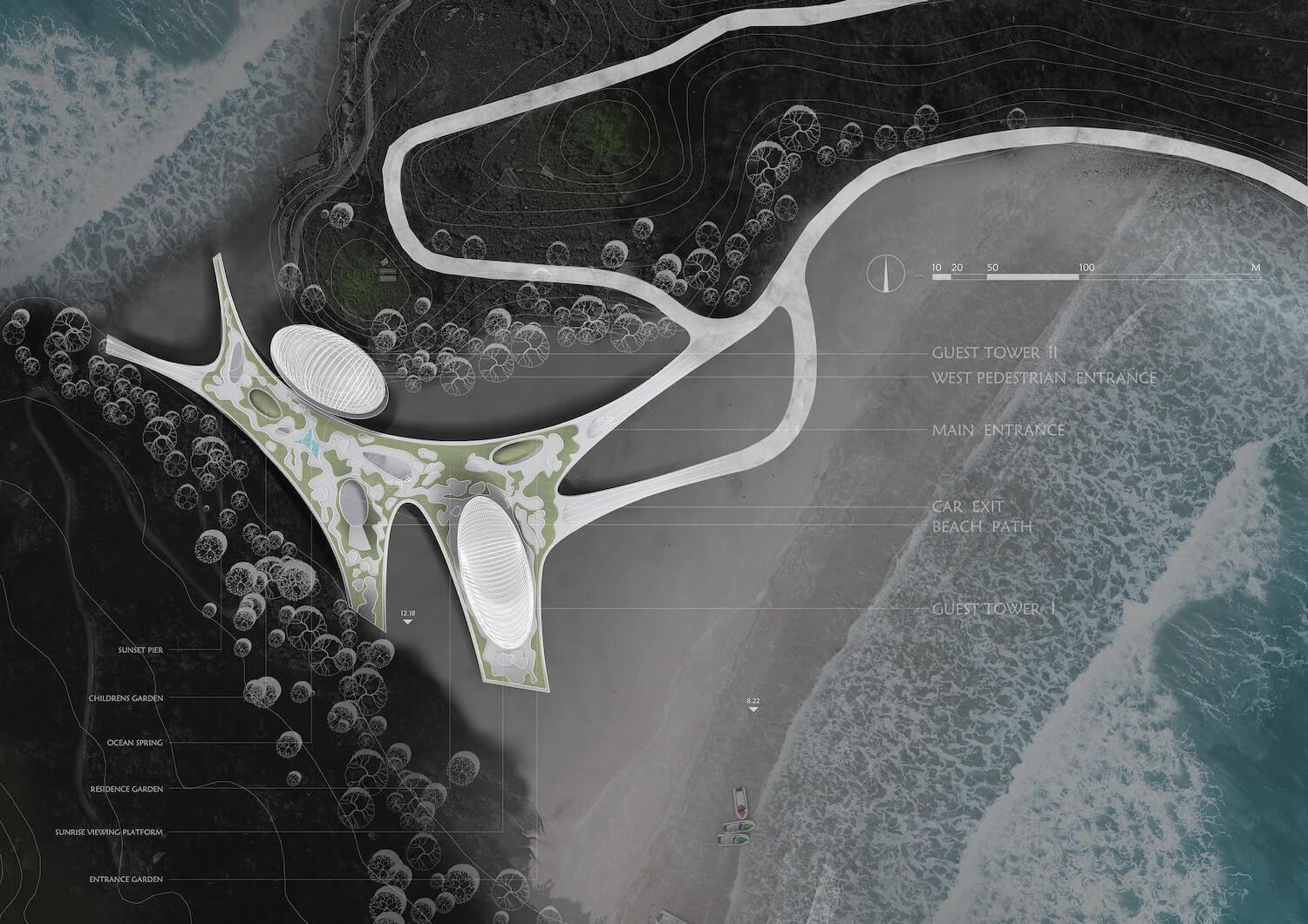
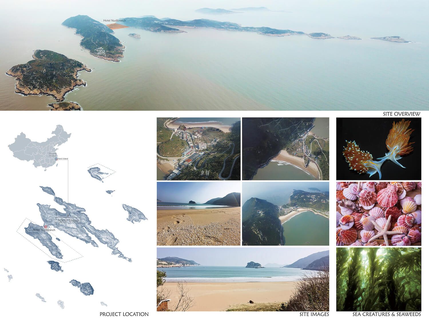
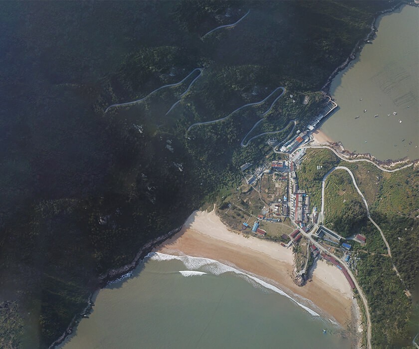
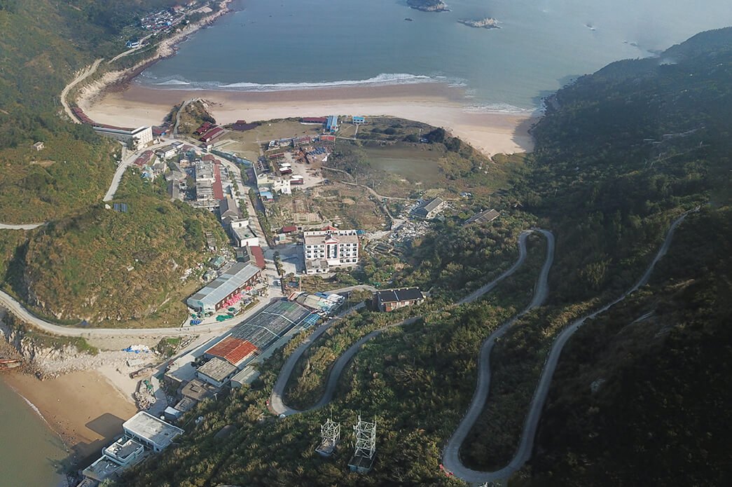
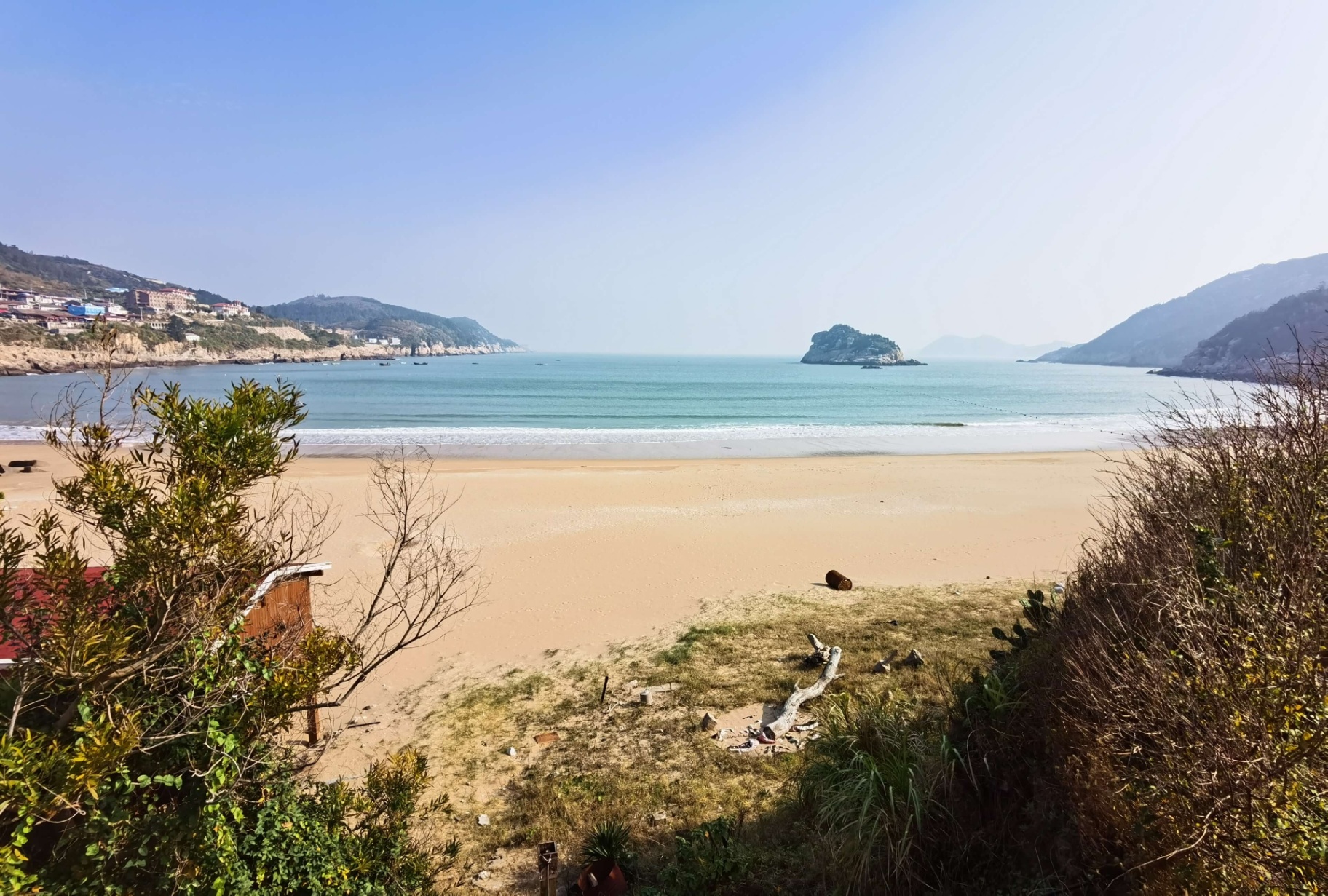
The site is located at the narrow part of the island, like a neck of land. The land is low lying as well as narrow. Through site studies, we understand the site was originally covered entirely by sand from the east to the west bays. It had been gradually occupied by people and had some small houses. With the island development plan designed to enhance tourism and for geological protection, the design started from a response to this and optimized the site. The houses have been removed and the site has been restored to a sand covered beach from east to west, facing two bays on two sides as it used to be. The sand is partially covered by the raised hotel, and this gives shade to tourists playing on the beach. Thus, the boundaries of the hotel are set horizontally instead of with normal plot boundaries. There are numerous ways the sandy ground connects to the public floor-space and the platform above, in order to generate different experiences. The public floor stretches to different parts of the site. The road passes through the building, embracing the west bay and overlooking the east bay, and gently curves to fit around the hill to the north. Internally, there are all kinds of public function areas located on the main floor. There are some hills that rise up from the public floor to the platform, to build up the interconnectivity as well as the visual and lighting connections. These are the part of the landscape of the roof garden system. The hotel rooms are placed in the glazed shells above the platform. The significant sea view offers high quality holidays. The building runs west to east, giving the best view for both sunrise and sunset. The building is not just a facility to accommodate the guests, but more an amplifier to enhance their experience of nature.
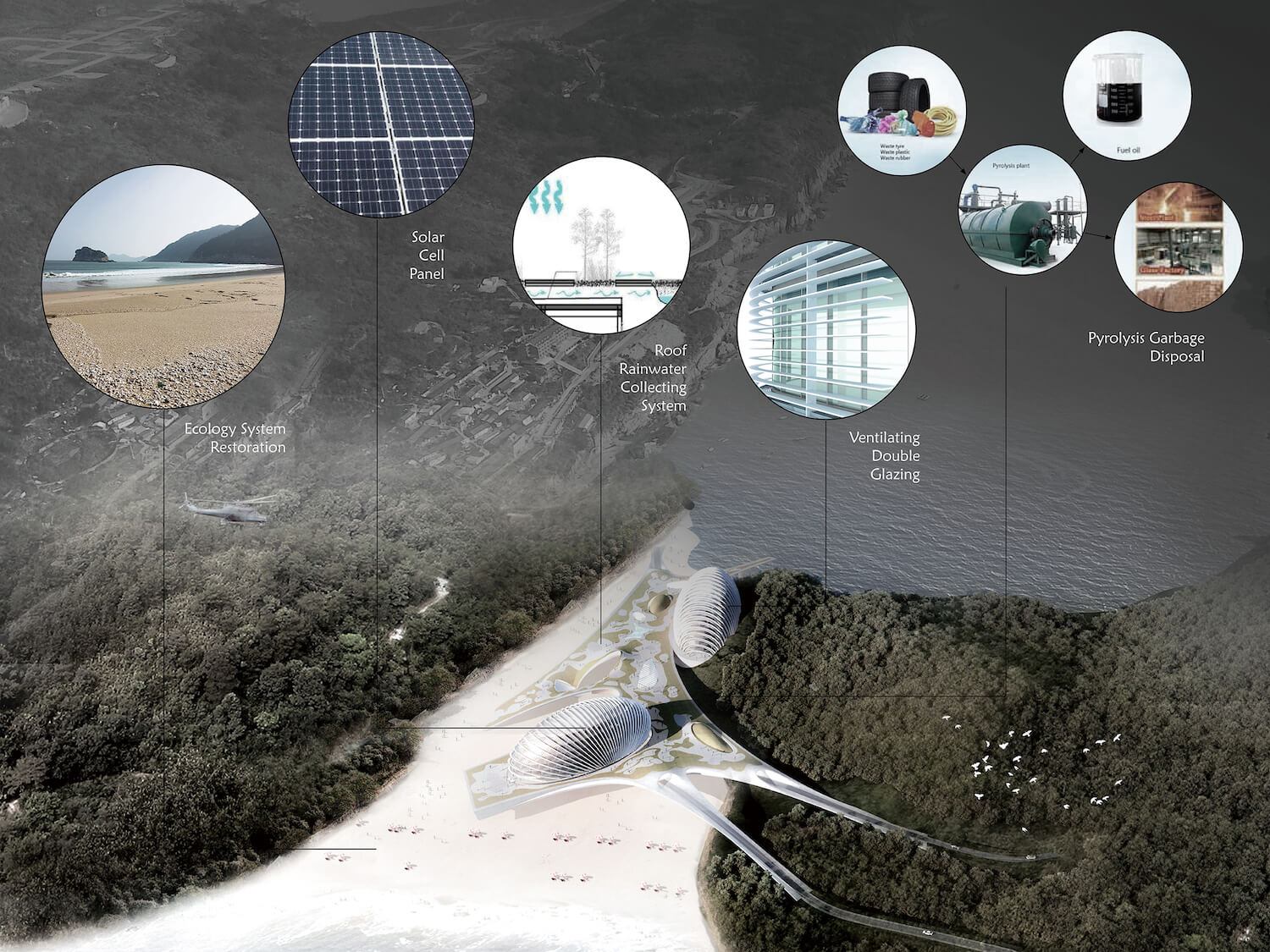
Ecological concerns were the main intent of the design. It started by restoring the sandy bay to its natural setup. The organic forms make it merge seamlessly into the environment. The shadow it casts on the beach makes the public space usable without air conditioning, in the heat of the summer sun. The top of the public floor is equipped with rain collection devices to utilize grey-water. The double skin shells of the hotel towers ventilate naturally. A biological waste processor generates power from garbage without the need for incineration. Furthermore, the organic shapes can be an inspiration for visitors to the island to explore the beauty and secrets of the sea. A parametric design technique has been used from the beginning. The design of the public floor has been completed using studies on traffic and site orientation. It enhances the connectivity of the roads from the mountain to the north and the beach. The penalization of the hotel glazing shell makes the panels less reflective to the sun, and to the surroundings at the same time. The development of the island is going to significantly upgrade the general tourism facilities, at the same time as improving ecological standards. The hotel’s unique design and layout is the iconic symbol of this ambitious plan. It is expected to be the diamond in the crown of Nanjin Island.
Arch Hive
More by Arch Hive
View profile