Back
37 Chioschi a Milano: a Catalogue
Year: 2020
Category: Landscape & Urbanism
Skills: Photography, Field Research, Mapping, Interviewing, Analysis, Archive Research, CAD Drawing, Rhino, Illustrator, Photoshop, Indesign
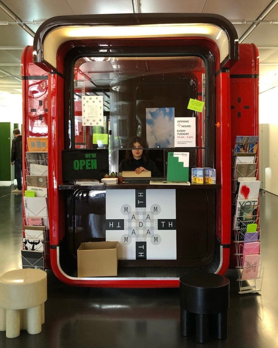
ABOUT This “Focus Work” was conducted during the Winter Semester 2020 by Chiara De Libero and Maria Margherita Innocenti with the support of the Chair of History and Theory of Urban Design of Prof. Dr. Tom Avermaete at ETH Zurich. PROJECT DESCRIPTION The urban space is occupied and defined by countless small architectures which, perhaps because of their modest size and humble character, have over time become undisputed elements of the city, to the point that one hardly notices their existence anymore. Among these microarchitectures, the kiosk is particularly interesting, not only for its architectural and social value, but perhaps above all for the urban one. As the smallest "building" in the city, it offers room for only one person inside, being at the same time among the most public spaces of all. It positions itself decisively in strategic urban points and gives life to important nodes of encounter and exchange. Free of any boundaries that separate the inside from the outside or the public from the private, the kiosk invites the passerby to approach, stop by and chat, giving back a significant sense of city and community. Living in Milan for some months we encountered many of these fascinating little structures and admired the phenomenon of the kiosk very closely. We became firmly convinced of its vital importance in the city, and recognized on the one hand the need to reinvent its shape and redefine its role in today’s society and on the other hand the urgency to safeguard existing structures of considerable aesthetic, historical or cultural value. In order to do this, it is essential to understand the phenomenon of the kiosk more deeply, to comprehend the reasons for its history and shape, to know how to read its role in the city with more precision. For this reason we felt the need to create this catalogue, which documents and studies 37 kiosks of the city of Milan. The selection of these objects is to a certain extent subjective, guided from our personal intuitions, influenced from our preferences, and shaped from the desire to tell certain stories more than others. We have dedicated much more attention, for example, to the structures close to disappearance. In this instinctive process, however, we have also tried to select the objects in such a way that they reflect the diversity of their forms and history.
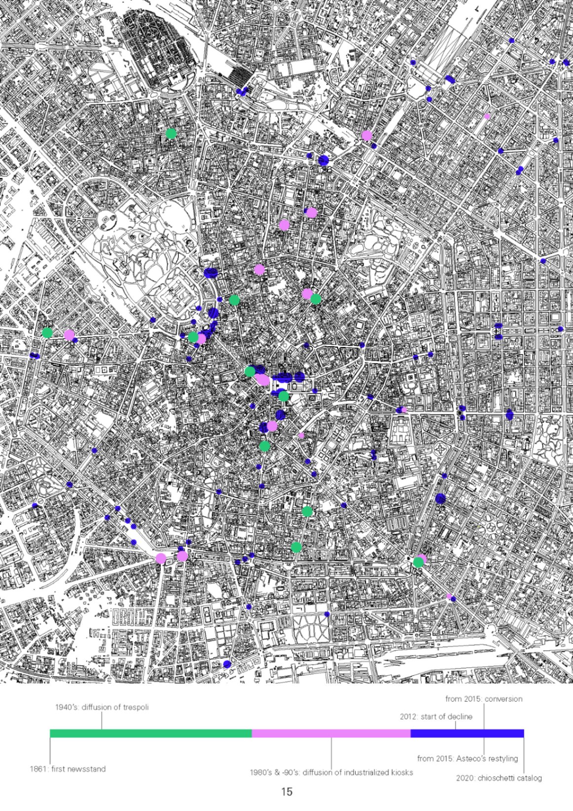
During our field research we have tried to locate as many kiosks as possible, focusing on the ones enclosed in the city’s external ring road. In the map all the kiosks we were able to find are represented with different colors. As visible in the timeline, the three colors indicate the three main time arcs that have outlined the milanese history of the kiosk. The oldest structures are represented in green, from the first ones, in the late nineteenth century, through the "trespoli" of the early 40s, to the kiosks and newsstands of the 70s. The color pink is associated with the kiosks built since the early 80s, when the phenomenon spread on a large scale and the structures began to be mass produced. In blue the most modern kiosks are reported, for example all the Asteco ones, following the restyling of 2015. The 37 selected kiosks are marked by larger circles and accompanied by numbers that allow their identification in the table. The mapping of the kiosks allowed us to come to interesting conclusions: as it was probably easy to guess, there is in general a greater concentration of kiosks in the historic city center. In particular, in the areas in correspondence of the two major tour-ist attractions, the Duomo and the Sforza Castle, one can notice a remarkable density of these small architectures, which are arranged around strategic points: subway exits, tram stops, particularly ex-posed square corners. Another interesting phenomenon that can be observed in the map is that often kiosks with different functions appear to be arranged in groups of two or three: the newsstand-florist combination is by far the most common.
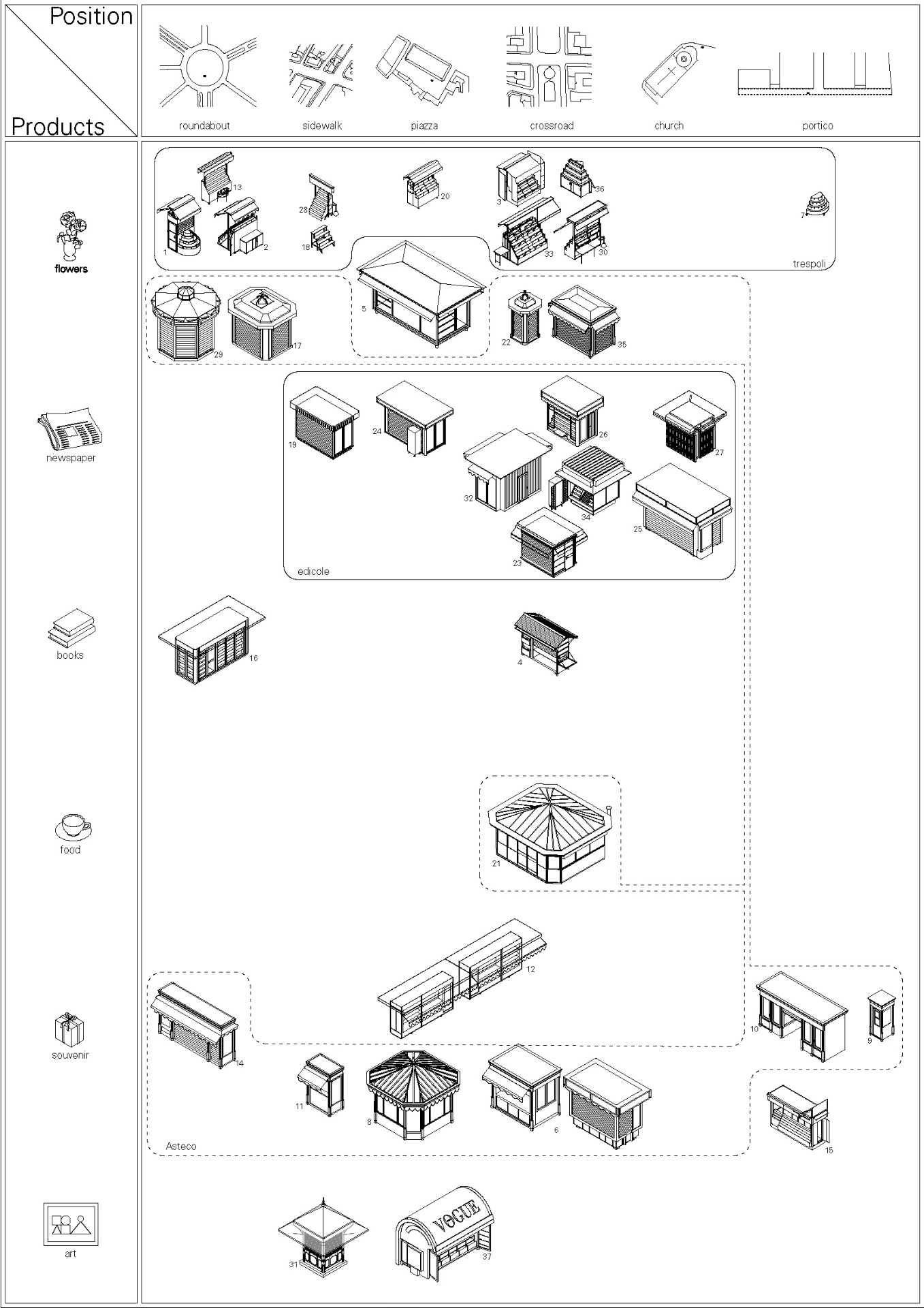
The table is an attempt to organize the 37 kiosks in relation to two of their main characteristics: their urban position and the products they contain. Position: We could notice some similarities in the positions of the kiosks in the urban fabric that allowed us to reduce to six the number of typologies, reported in the top row of the table. Kiosks are always located in the busiest nodes of the city: on the side of a roundabout, along the sidewalks of important streets, at the corner of a square, facing a crossroads, at the exit of churches, or wedged between the arcades of large public buildings. Products: The range of products sold can be reduced to six categories, listed in the left column: the two main ones are flowers and newspapers, followed by kiosks used for the sale of souvenirs and immediately after by the kiosks that sell books and food; more and more widespread, and in our opinion worthy of note, is the phenomenon of the conversion of abandoned kiosks into small points dedicated to the spread of art in the city, so that the sixth category has been optimistically reserved for art. By carefully observing the table it’s possible to understand how the two aspects, position and function, are closely linked and strongly influence the final appearance of the kiosk. The dimensions and proportions of the structures are dictated by the context in which they are located. A kiosk that has to be placed under the arch of a portico must, for example, have very precise measurements and, already protected from the sun and bad weather, it doesn’t need any curtain. A newsstand that will be placed on the sidewalk will not be wider than the sidewalk itself. Similarly, the shape of the kiosk changes depending on the product being sold. For this reason the first flower kiosks developed in the form of "trespoli": fresh and fragrant flowers must be clearly visible, without any kind of barrier separating them from the consumer, as close as possible to the passerby, ready to be smelled, admired, bought. Newspapers, on the contrary, have less need to be admired, the consumer in most cases already knows what he wants. Newsstands are therefore almost always square in shape with just one side open to the consumer displaying the products. Based on the final appearance of the kiosks, we have highlighted three groups in the table: the already mentioned "trespoli", with their small size, the green metal steps, and the wheels for easy movement. The "edicole", square or rectangular in shape, with the thick flat roof that shows the name of the newspaper. And the modern kiosks of Asteco brand, based on ancient models from which they take decorative elements such as the columns, the frieze, the tips on the roof.
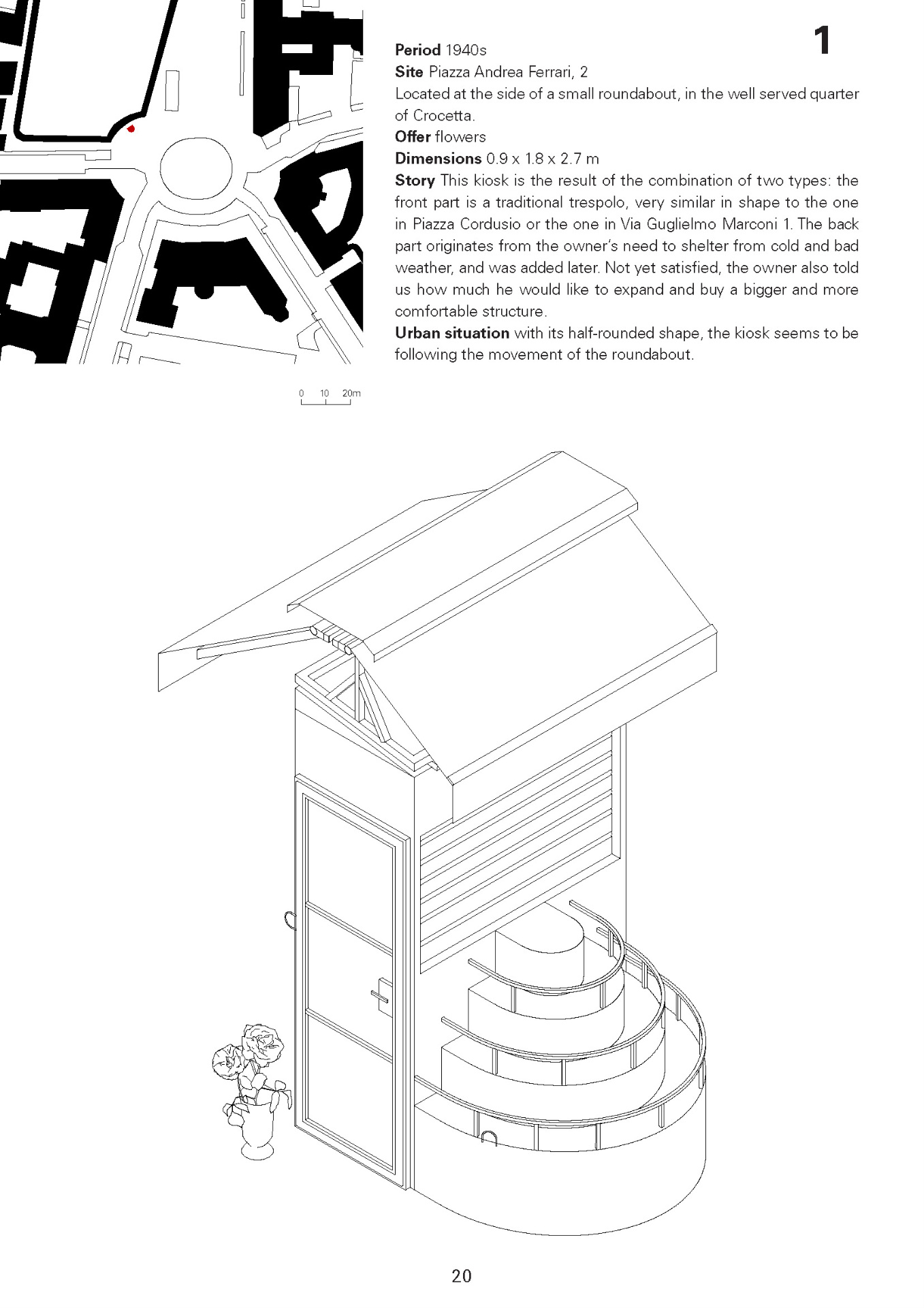
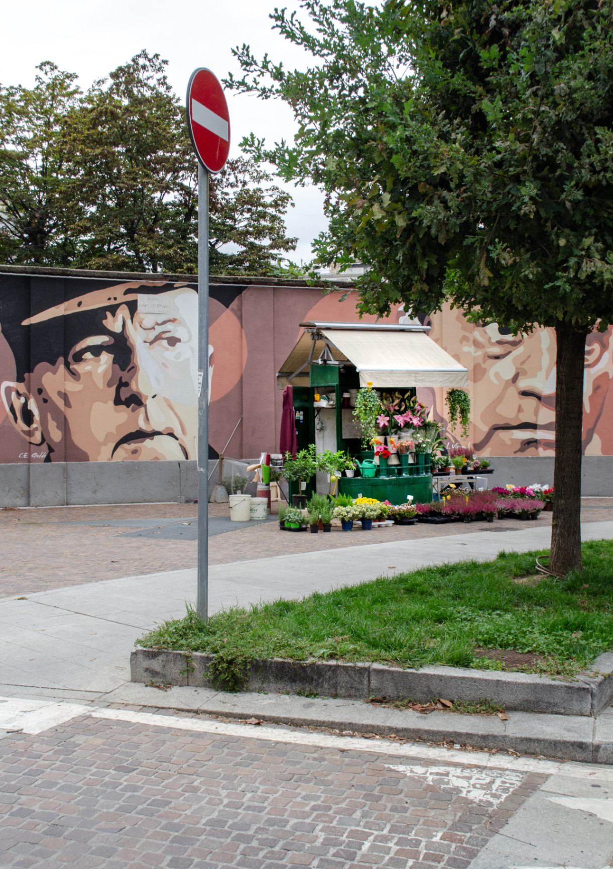
After a brief summary of the global and Italian kiosk history and an overview of the 37 selected kiosks in Milan, the remaining pages of the catalog are devoted to the documentation and analysis of the single objects. Countless factors define and distinguish each kiosk, and there are many phenomena that would be worth studying and investigating. Kiosks are small architectures that create incredibly powerful social spaces. They are structures that act dynamically in the city, moving around in the urban fabric and changing appearance by day and by night. They define grey zones between public and private, expanding like wildfire into the common space and appropriating the surrounding territory with a variety of additional objects. Using several representative methods we investigated the factors that interested us the most, creating a profile of each object that is as exhaustive as possible. Two pages are dedicated to each kiosk: the left page contains a sitemap, an isometric drawing and a short text. On the right page the kiosk is captured in a photograph. Sitemap: The sitemap shows the immediate surroundings of the kiosk, providing essential information about the urban situation and revealing the contrast between the microscale of the object and the macroscale of the city. In the map, the responsiveness of the kiosk to its context becomes visible. Photograph: The juxtaposition of the light metal structures of e- phemeral appearance and the heavy stone and concrete buildings with their long lasting presence generate a powerful, contradictory, sometimes paradoxical dialogue. The photograph of the kiosk with the background of the city reveals this tension. Drawing: In the photographs, the kiosks can appear empty at night, at times closed or abandoned, but mostly they present themselves covered under such a big amount of selling products that they are hardly recognizable as objects anymore. The isometric CAD drawing, precise and objective, complements the photograph by showing what is not visible in it. Sometimes unveiling the object, freeing it from its content, thus enhancing its shape, sometimes opening a closed structure, sometimes showing its forgotten past. The very act of redrawing the objects allowed us to fully understand the reasons for their form and to achieve a deeper knowledge of their qualities. Text: Every kiosk has its own dynamic. Historical facts, political decisions, family traditions and client-related matters define its story and make it unique. In the short text we provide basic information such as address and dimensions and briefly report discoveries that we ourselves made on site, facts learned reading online articles or stories and curiosities that the owners told us with enthusiasm.
Maria Margherita Innocenti
More by Maria Margherita Innocenti
View profile